My First Python Visualization Project - A Content Marketing Planning Tool

In this post, I will share a content planning matrix powered by Python which can be dynamically structured to help us think which content type could support marketing goals more cost-effectively.

My First Python Visualization Project - A Content Marketing Planning Tool

Are you embarking on a digital journey as a marketing professional? Are you curious about how Python could help you do less and achieve more?  In today's blog, I will be sharing my first data visualization project and how it allows me to shape branding content strategies. I hope my experience brings you the courage to start your adventure in leveraging Python to take your digital marketing strategies to the next level.


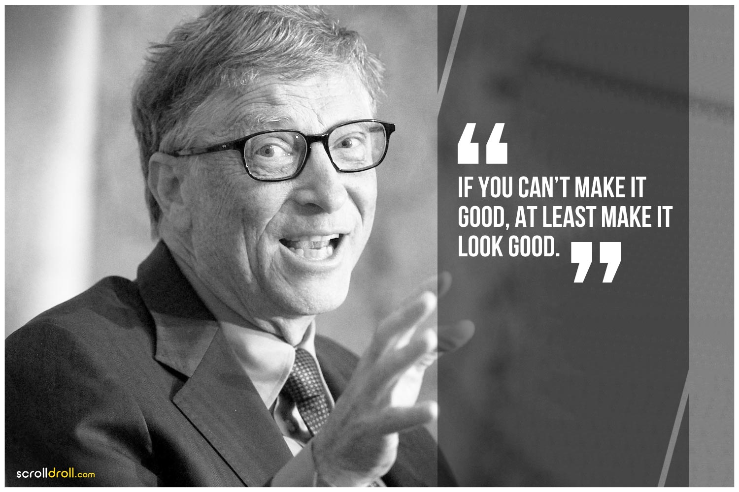
Did you know the quote “content is king” is originally from Microsoft founder Bill Gates's essay as early as 1996?  

Source: ScrollDroll

Since the Internet became mainstream in the early 2000s, the demand for high-quality content has continued growing. Bill Gates proved that he knew what humans would want even before.

Content marketing remains in the position of the king – every proper digital marketing strategy needs a content plan.

I am so excited to test my Python learning to create a content planning matrix. Guy Kawasaki's 2011 book Enchantment: The Art of Changing Hearts, Minds, and Action inspires me. With Python, I am able to dynamically structure the content matrix to help us think through two key dimensions, of which content type could support your marketing goals more cost-effectively.

Why Content Marketing Is Important

Traditional marketing relies on the push mentality (some people call it "outbound") – to get messages in front of a target audience.

In the digital marketing era, the more push, the merrier?

Whether you choose to Agree or Disagree, did you know the collective global Internet users' attention span has narrowed down to about only 8 seconds?

Fortunately for them, search algorithms developed by Google, Meta, or Twitter will prioritize the most relevant content while filtering out most of the one-size-fits-all marketing cliches. For marketers, quality matters because we are in a relatively fair and open arena to compete for user attention, and only the most compelling message would win.

Therefore, in the past decades, research from psychology to business has been about understanding the buyer's mind, which generates a massive amount of nuts and bolts of content marketing - snackable content, hacking a trend, breaking news, or branching out with influencers...

There are thousands of success stories about them, but how could you choose the ONE that serves your campaign goals? I found the book "Enchantment: The Art of Changing Hearts, Minds, and Action" by Guy Kawasaki, former chief evangelist at Apple, may hold the answer.

Guy Kawasaki, Enchantment: The Art of Changing Hearts, Minds, and Actions

How To Understand A Content Marketing Matrix

Source: Search Engine Journal

A marketing content matrix is a planning tool to assess marketing content and think about where to take it in the future. You can locate weak spots, highlight strengths, and make sure you’re emphasizing the content areas that best resonate with your audience. The two critical dimensions of the matrix are:

  • X-axis: Awareness-to-action conversion funnel
  • Y-axis: Emotional-to-rational content engagement

The four quadrants – entertain, inspire, educate, and enlighten – is your starting point to review how your content portfolio can support specific goals and where the gaps are.

Why I Created A Content Matrix by Python

A few weeks earlier, I started picking up Python again since I graduated from Berkeley. While I was studying the Matpplotlib library in Python, the idea of creating a content matrix by Python just came to my mind. Although Tableau and Power BI probably have more straightforward options for business analysis, working on Python has been an exciting experience.

Specification

My initial goal is to map a specific marketing content based on its emotion & awareness attributes scores to a 2D matrix. The program is supposed to have the following features:

  1. Create a scatterplot with two dimensions - Awareness vs. Conversion; Rational vs. Emotional
  2. Assign values to the awareness & emotional attributes of one type of marketing asset by calculating the average scores from the survey
  3. Dynamically adjust the subject's location on the matrix, color scaled by the following categories:
  • 'Entertain' : 'yellow',
  • 'Educate' : 'green',
  • 'Persuade' : 'blue',
  • 'Convert' : 'purple'.

Implementation

First, I make a basic scatter plot with Matpplotlib in Python with the scatter() function in Matplotlib.pyplot from the Pandas.

content_data="https://raw.githubusercontent.com/emsgobears/Content-Matrix-Data/main/datatest2.txt"
df = pd.read_csv(content_data, sep="\t")
df.head()
x=df.Awareness
y=df.Emotion

Second, multi-feature scatter plots can help explore and present data. In Matplotlib’s scatter() function, we can color the data points by a variable using the “c” argument. The color argument “c” can take:

  • A scalar or sequence of n numbers to be mapped to colors using cmap and norm.
  • A 2-D array in which the rows are RGB or RGBA.
  • A sequence of colors of length n.

colors = {'Entertain':'yellow', 'Educate':'green', 'Persuade':'blue', 'Convert':'purple'}
plt.scatter(x,y, c= df['Category'].map(colors), cmap='viridis')
plt.xlabel("Rational --> Emotional", fontweight ='semibold',  size=12)
plt.ylabel("Conversion --> Awareness", fontweight ='semibold', size=12)
plt.title('Interesting Graph\nThe Content Matrix')

Third, Matplotlib also makes it easy to add annotations or text to scatterplots by using the annotate( ) or plt.text( ) functions.

for i in range(0,df.shape[0]):
plt.text(x[i]+0.2, y[i]-0.3, T[i], horizontalalignment='right', size=7, color='grey')
💡
Check out the full codes HERE.

Output

Here is a screenshot of the output:

The two dimensions used in the matrix show different content assets can develop awareness and reach through the purchase process to nurture purchase.

For example, on the top right corner, "influencer video" is likely to go viral and support establishing thought leadership or catching attention, marked in yellow. Then third-party ratings, case studies, and other content colored in blue can further "persuade" the prospects with trust and authority. Educational content like a whitepaper or industry report, marked in green, could support the opportunities to make a rational decision. Moving towards the end of the buyer's journey, FAQ or pricing content can help complete the purchase.

Usage of this content planning tool in Python

  1. Assess the value of different types of content based on your target audience, industry, market trends, and, most importantly, your business goals. You can collect data inputs through an internal survey or a focus group.
  2. Audit existing content, count and group them into major categories, i.e. white papers, webinars, blogs, etc.
  3. Run the program in Python to generate your unique matrix.
  4. Analyze the results by doing gap analysis and brainstorming future content types.

What's Coming

I realized a more sophisticated approach would map content for each persona, as shown in this persona template.

As I continue my Python learning journey, I look forward to updating this blog post, so you can confidently deliver the most effective content across all kinds of crucial customer persona in their decision-making journeys.

Finally, I want to thank those who have encouraged me to continue my learning of data visualization. This blog would be impossible without your support!